Executive Summary
The current paper dwells on the importance of visualising obtained data properly. The data set obtained by the researcher from Google in regard to the mobility trends across the United States could be utilised to establish a better connection between the impact of the pandemic and responses from the government, private organisations, and individual citizens who also have to cope with the outcomes of quarantine and self-isolation.
Therefore, the current paper represents a detailed overview of possible scenarios that could affect the country on a long-term scale in the case where the three parties from above choose to remain idle.
The first scenario proposed by the researcher was a small local restaurant exposed to the outcomes of COVID-19. One of the potential solutions proposed by the author of the current paper was to address the effects of isolation with the help of establishing broader delivery opportunities and creating more opportunities for the customers to order food online and not visit brick-and-mortar restaurants. The three types of visualisation picked for the current scenario were a Cartesian diagram, a cycle diagram, and a timeline.
The second scenario proposed by the researcher related to a workplace where the management had to decide on how the company would transport essential staff members to the workplace. Based on the data set obtained by the author of the current paper, it was decided to include corporate transportation, public transportation, and taxi as the most reliable options. As for the three types of visualisation for the second scenario, the author picked a line chart, a pie chart, and a tree map.
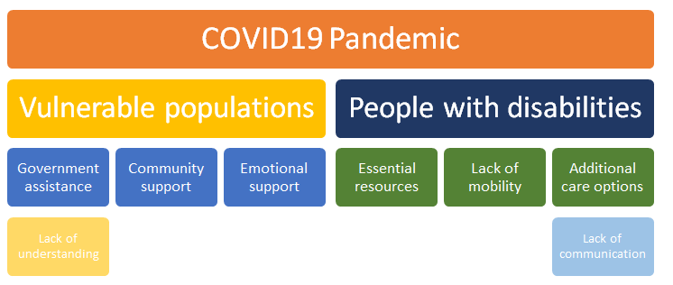
The third scenario proposed by the researcher touched upon the role of city administration representatives during the pandemic. The impact of COVID-19 on vulnerable populations and individuals with disabilities is evident, as the virus affects social, economic, psychological, and physiological conditions with no hesitation. The solution proposed within the framework of the current paper includes visualisations in the forms of a decision tree, an area chart, and a concept skeleton.
Data Description
The current data represents mobility changes during the COVID-19 across the United States. The value of this data is supported by the idea that businesses could address the changes that occur within the community to align their operations and products against the needs and possibilities of the consumers. One of the ideas why Google came up with generating the mobility change reports is that the negative effects of COVID-19 have to be remediated (Sun et al., 2020).
Additional information regarding consumer mobility could be utilised by a variety of customers who are looking for products and services that are available irrespective of the situation in the world. The current data cannot be used for any other purposes rather than prediction of business trends, as it mainly focuses on the changes that occur in different geographic regions of the United States. Based on the proposed mobility reports, businesses may compare changes across different states and make important decisions regarding the business approaches that they could resort to in the nearest future.
The current mobility report shows that the areas of retail and recreation and grocery and pharmacy undergo a decrease in the number of consumers at the moment. A similar trend is characteristic of the transit stations and workplaces, which means that only a limited number of individuals is allowed to move using public transportation and visit their physical workplace (Kraemer et al., 2020).
On the other hand, the report explicitly shows that mobility trends for places of residence continue to increase and the number of people who begin visiting national parks, public beaches, marinas, dog parks, plazas, and public gardens increases. As per the recommendations from Google, this data may not be utilised to compare COVID-19-related data among countries. Nevertheless, this data set could be seen as a statistically significant element of research. The idea here is that such mobility data could be used by different businesses to predict consumer behaviour and respond to the possible changes in a timely manner.
Proposed Business Scenarios
Business Scenario 1
The first scenario is a small local restaurant that has to be deal with the outcomes of the pandemic and refine its operations to respond to the COVID-19 situation. The company has to set up delivery and offer its customers a possibility to get access to food of the same quality that the restaurant provided when it was a brick-and-mortar organisation. The data set proposed by Google could be a beneficial option for this local restaurant, as the management would gain more insight into what kind of customers they should expect to welcome delivery and make the best use of refined operations.
The idea here is that the proposed data set would serve as proof of existence of additional options required for the restaurant to attract new customers and retain the existing ones during the quarantine. In a sense, the management would be responsible for checking in with mobility data daily to monitor the potential number of consumers that could be attracted by quarantine specials unavailable during the times before COVID-19 situation.
Business Scenario 2
The second scenario is the provision of employees with opportunities of working online and not having to visit their physical offices. Accordingly, the strain on public transportation would decrease and numerous organisations would translate their operations into the online environment to protect employee health and protect the local infrastructure from unnecessary expenditures. The problem with public transportation is that there are individuals who do not have any viable alternatives to existing transport and have to resort to spending money on taxi services.
The situation becomes especially tricky owing to the COVID-19 situation and the lack of alternatives that could be explored by organisations that still require their essential workers to come to work.
It raises the question of resorting to private transportation companies and spending additional resources on taking employees to work irrespective of where they live and how long it takes them to get to work. During COVID-19 quarantine, organisations that cannot afford closing their operations have to come up with the best solution for saving resources while allowing their employees to get to work safely. The current data set could help such organisations predict the possible outcomes of transportation-related decisions.
Business Scenario 3
The third business scenario relates to how companies providing essential services and products could reach people with disabilities and special needs. The problem here is that the quarantine situation has made it exceptionally hard for individuals with disabilities to reach their favourite shops, restaurants, parks, and other recreational spaces. The lack of understanding among the city administration could be addressed with the help of analysing the proposed data set.
The conclusions made on the basis of data set analysis would also have to be discussed in association with the representatives of people with disabilities to ensure that possible changes in how essential organisations operate would not affect the people with disabilities in a negative way. Therefore, the data set provided by Google could be one of the easiest ways to define the areas where the population with disabilities needs help the most.
The inherent idea here is that the value of quantitative reports should never be underestimated. Especially, when the collected data touches upon a vulnerable population that might not have the opportunity to protect their rights or achieve certain objectives during the pandemic.
Descriptive Analysis and Justification
Scenario 1
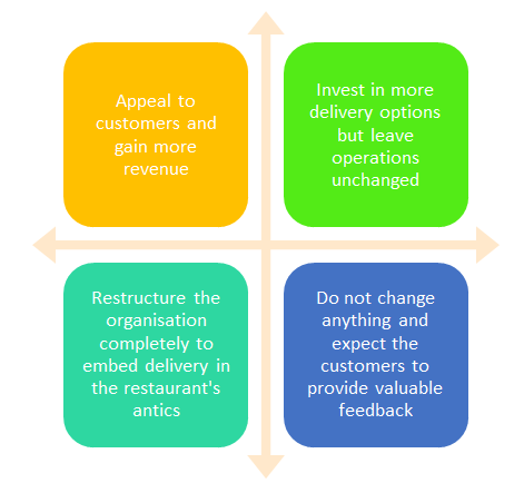
The first possible visualisation option in this case are Cartesian coordinates. This visualisation may be required to outline the possible outcomes of decisions made by the restaurant’s administration (Kumar et al., 2020). Justification: the value of Cartesian coordinates (see Figure 1) may be explained by increased chances to define the best development vector for the organisation without conducting any serious research and development operations that might require specific monetary expenditures.
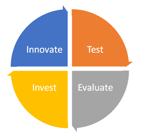
Another way to present the restaurant’s data could be a cycle diagram (see Figure 2). It would be utilised by the management to set up the right operation cycle and define the essential steps that the team would have to make in order to succeed and retain the majority of consumers. Justification: the rationale for choosing this type of visualisation is also the fact that it is one of the simplest ways to present information and explain the need for change and improvements using visually appealing instruments.
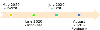
The timeline visualisation option is also an important (see Figure 3). It would provide the team with a representation of how the restaurant’s operations translate into revenue and whether it is going to provide the team with any competitive advantages over their rivals. Justification: the team could use the timeline to assess the period that it took them to implement the required changes and achieve pre-set objectives.
Scenario 2
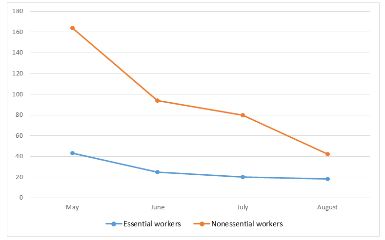
One of the best visualisation options for the second scenario would be a line chart (see Figure 4). The rationale here would be that the organisation would have a chance to evaluate the trends regarding their employees and decide on the best transportation type that could help them get all employees to work in time. Justification: the line chart below might be utilised to display a hypothetical outcome of the proposed scenario based on the existing data set where the number of both essential and nonessential workers would decrease owing to the COVID-19 pandemic.
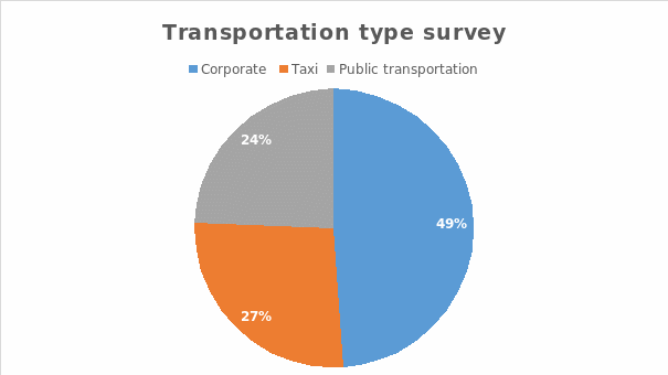
The organisation could use a pie chart (see Figure 5) to present information regarding the employee opinions and pick the best possible transportation option to help the essential staff get to work safely. The existing data set provided by Google displayed a decrease in the mobility trend in terms of transit stations. Justification: according to Falvey et al. (2020), this could be an indispensable piece of evidence for the management, as it would help the administration allocate available resources and establish a better connection with essential employees who matter to the company the most during the period of COVID-19 pandemic.
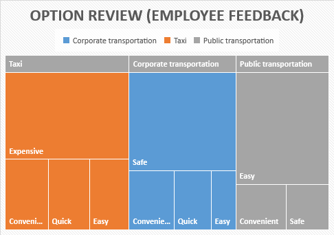
The tree map could be a helpful instrument as well (see Figure 6). Essential employees should be the ones who have the full right to decide how they would like to get to work during the pandemic. Justification: the team will be able to use the tree map below to present the available data in graphic format and make a decision regarding which transportation type would be the best for the organisation.
Scenario 3
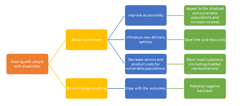
The decision tree below (see Figure 7) represents the possible options available to the city administration in the case where it has to cope with the outcomes of the pandemic. The tree makes it evident that the administration has multiple options available in the case where it adjusts its operations in line with the needs of the vulnerable populations. Justification: the rationale for including a decision tree as a visualisation instrument is that it is the quickest way to establish the possible ways of approaching certain populations during disastrous events.
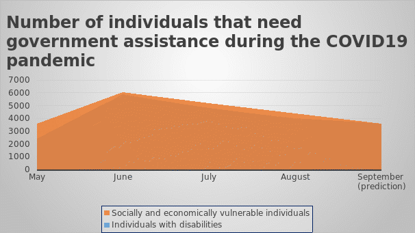
The following area chart bears an important connotation to the data set on COVID-19 pandemic because it shows how many individuals with special needs would be affected by the disastrous events (see Figure 8). The city administration representatives might pay attention to this visualisation because it serves as one of the possible ways to monitor the COVID-19 trends and respond to them in the most reasonable way.
Justification: the current visualisation is essential because it establishes the potential number of disabled and vulnerable individuals who would require government assistance during the pandemic, which is an important point because government assistance is not infinite.
The concept skeleton from below (see Figure 9) is a crucial addition to the subject because it might provide the administration with additional ideas regarding how both people with disabilities and vulnerable populations could be addressed. During the COVID-19 pandemic, a broad concept skeleton could become an instrument allowing the team to outline the best strategies and most valuable resources.
Justification: the rationale behind including a concept skeleton in the current project is that the majority of notions included in the frame could help the administration approach other communities in the future as well.
Findings and Suggestions
The current paper serves as proof of the fact that there are numerous opportunities to visualise the same data using different instruments and gain access to different outcomes depending on the tools used. The data set regarding COVID-19 mobility trends provided by Google offers business analysts a variety of approaches to how essential information could be analysed and further reported across the company, organisation, or community. The lack of awareness could be easily overcome with the help of infographics including at least some of the visualisations included in the current paper.
From local business decisions to state-wide operations, no team should ignore the value of how information collected by the staff could be envisioned and communicated to other people. Overall, the current paper confirms the positive impact of visualisations on businesses, organisations, and individual citizens and suggests that everyone should improve their knowledge of how different types of data could be processed and presented.
References
Falvey, J. R., Krafft, C., & Kornetti, D. (2020). The essential role of home-and community-based physical therapists during the COVID-19 pandemic. Physical Therapy, 100(7), 1058-1061.
Kraemer, M. U., Yang, C. H., Gutierrez, B., Wu, C. H., Klein, B., Pigott, D. M.,… & Brownstein, J. S. (2020). The effect of human mobility and control measures on the COVID-19 epidemic in China. Science, 368(6490), 493-497.
Kumar, D., Kumari, K., Jayaraj, A., Kumar, V., Kumar, R. V., Dass, S. K.,… & Singh, P. (2020). Understanding the binding affinity of noscapines with protease of SARS-CoV-2 for COVID-19 using MD simulations at different temperatures. Journal of Biomolecular Structure and Dynamics, 1-14.
Sun, Y., Koh, V., Marimuthu, K., Ng, O. T., Young, B., Vasoo, S.,… & Lin, R. T. (2020). Epidemiological and clinical predictors of COVID-19. Clinical Infectious Diseases, 71(15), 786-792.