The image in advertising is a central element, as it gains viewers’ attention even as they walk past the billboard on the street. For this reason, companies need to succinctly and vividly put the value and purpose of a product or service into one picture. An image for a moisturizer for men from Nivea is an example of such an advertisement, as it attracts the attention of the target audience and encourages the purchase of a product with a simple picture and a couple of apt words.
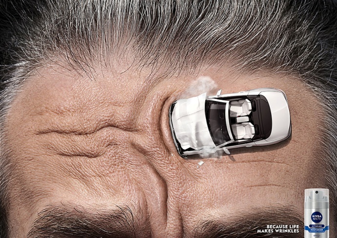
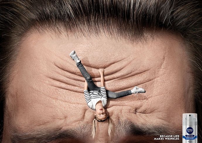
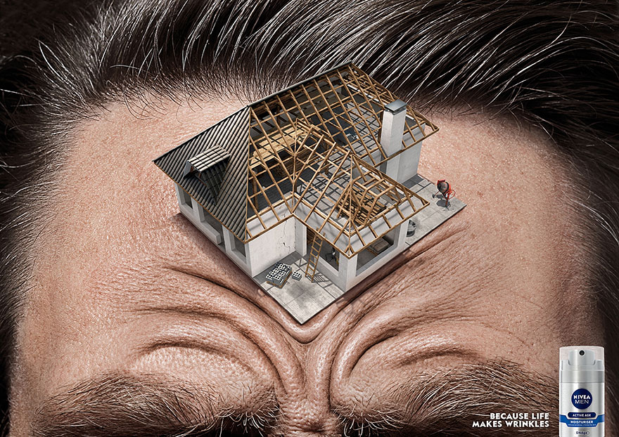
Advertising body care products for men is a challenging task as the culture of most societies restricts the use of cosmetics to men. Consequently, even a skin moisturizer to reduce wrinkles requires a sensitive advertising approach to attract but not frighten the target audience. In a series of photographs by Nivea, the viewer can see that the company has managed to find its audience’s interest by addressing understandable life issues. In all the images, the center of the frame is a man’s forehead with deep wrinkles on a large scale.
The difference between the pictures is that an unfinished house, a playing child, or a wrecked car is the reason for these wrinkles. Since this image is in the center, it aims to attract attention and demonstrates the main concern that is relevant to men. This symbol expresses the stress that men face due to the need to solve “adult” problems, such as repairing a house or car, and raising children. Therefore, the primary approach to attracting a customer is to highlight the common problem and only then demonstrate the solution.
Moreover, in the picture, one can see a small image of the Nivea moisturizer, which also has its appropriate location. This modest position in the corner of the photo emphasizes that the customer’s problem comes first for the company, and their product is the solution. However, while the company logo is clearly legible, the product name is poorly visible, which can be a disadvantage and an advantage at the same time.
A potential buyer can pay attention to the brand but do not know what kind of product he needs and will refuse to buy it to save time. On the other hand, since there are practically no differences between moisturizers from different brands, the emphasis on the logo can force the buyer to choose this company instead of accidentally buying moisturizer from another brand. Therefore, the given location and scale of the product image is logical and appropriate in this context.
Another element that is critical to this advertisement is the text accompanying the image. In the corner of the picture, one can read the phrase “Because life makes wrinkles,” which is an emphasis that attracts the audience. Since any background information in the image adds context, these words are also an explanation (Sheffield). This phrase is clearly readable, as it is written in white letters on a dark background, and is located next to the product image, which creates an association between them.
The laconic idea makes it clear that wrinkles are a normal part of growing older for all men because they face challenges and stress in their life. However, the association formed earlier demonstrates that wrinkles, as well as stress, can be overcome or mitigated by using the Nivea product. Thus, while the overall image is self-explanatory, the phrase reinforces associations and encourages the viewer to purchase the product.
Furthermore, the use of colors is also an essential part of the image. The photographs of the men are set against a dark background, which helps create contrast. The black color that surrounds the head symbolizes stress, which puts pressure on the man and, at the same time, highlights the central picture of wrinkles. This background also allows the metallic design of the product and the white color of the text to stand out by making them more visible. In addition, all elements also have cool tones, which keeps the picture restrained and does not allow distracting attention from the product. Therefore, all colors are matched, and their combination is consistent with the advertising context.
In conclusion, the advertisement of Nivea’s moisturizer for men has all the elements that make it effective for selling a product. The main idea is relevant and appropriate for the different men in the target audience since it refers to life’s problems. The location of the elements and their design also contribute to the disclosure of this idea, attract the attention of potential buyers, and incline them to purchase the product. Simultaneously, the use of discreet colors and tones makes it possible to make the product visible in the overall composition without distracting attention from the central idea. All these elements combine to create the perfect image for advertising a men’s beauty product.
Images
Work Cited
Sheffield, Jenna Pack. “Breaking Down an Image“. Writing Common. 2016. Web.