This report provides information about the extent to which the home page on the UK version of Amazon.co.uk complies with W3C’s Web Content Accessibility Guidelines (WCAG 2.1). Section 4 of this report deals with the assessment of website content, while section 5 provides a number of specific actions that can be applied to correct development errors. It is essential to recognise that based on the criteria for success given in WCAG 2.1, this website does not meet the minimum requirements for ease of perception by different categories of users.
Background about Evaluation
In an era of the global availability of various information resources to meet consumer demands, the universality of the way content is presented is essential. In other words, with the growing accessibility of the Web for different categories of people, there is an increasing need to develop web page functionality that is suitable for any user. Thus, with the help of the Internet, a modern user can watch videos, listen to music, chat on social media with friends or make purchases on online shopping platforms. Regardless of the focus of the website, in order to increase customer traffic and maintain user-friendliness, each of the existing Internet platforms must have the necessary adaptability to allow a person with blindness, physical, auditory, psychomotor, cognitive, linguistic or learning characteristics to use the page interface seamlessly. However, developers often ignore some critical criteria that could guarantee the success of the platform. As a result, some users with disabilities mention may have negative experiences with the site, which may result in either a complete rejection of re-visiting the web page or continued interaction that will cause adverse feelings. Obviously, companies should be interested in increasing the loyalty of their customers, including through online platforms: for this reason, website developers should adhere to the success criteria described in WCAG 2.1.
The evaluation of the content presented on the website corresponds to the date 04 August, 2020. Nevertheless, it should be admitted that the interface of the page will most likely change over time.
Scope of Review
- Amazon.co.uk.
- online product sales.
- www.amazon.co.uk
- Only the home page of the website has been analysed.
- 04 August, 2020.
- English version of the web page.
Review Process
Size of Active Control Icons
- WGAC 2.5.5, Operable, AAA
- Web page HTML code.
- Automatic calculator.
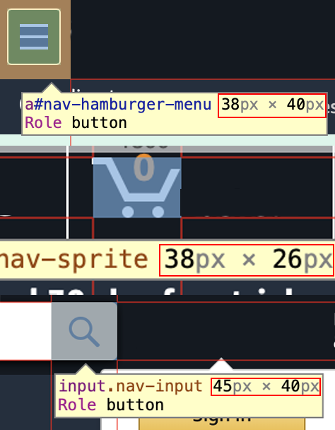
One of the most common requests among users with disabilities is the size of active images. There is no doubt that large enough navigation button icon makes the site more suitable for people with eyesight problems. A close look at the content on the Amazon.co.uk reveals at least three essential icons, as shown in Figure 1, which are used daily by the user when working with the web page. The size of these icons is expected to comply with the WCAG 2.1 limitation on non-text active control content: success criteria 2.5.5 of the Operable principle, level AAA, sets target sizes for icons that should be at least 44×44 pixels. The analysis of three images placed on a web page allows concluding that the icons for menu, search and basket do not meet this criterion (Figure 2). In particular, icons on average are one and a half times less than the necessary minimum, which may become an important problem for people with visual impairments. Fixing this problem does not seem to be challenging because, to meet the size criterion, developers need to increase the scale of icons by several pixels.


Contrast Colours of Text and Background Image
- WGAC 1.4.6, Perceivable, Level AA
- Web page HTML code, contrast ratio calculator3, color-coding matching panel.
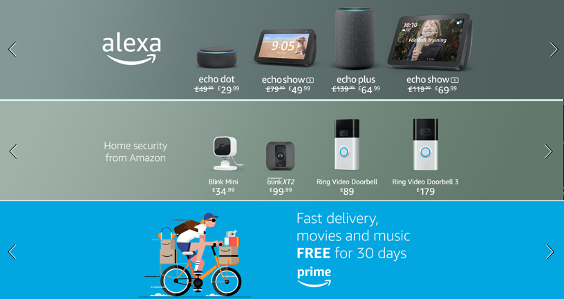
Thanks to the contrasts, designers traditionally highlight essential interface elements and emphasise the necessary information. Significance of contrast is appreciable at work of people with the limited eyesight or the attention disorders since they cannot concentrate on a necessary element and colour support is required to them. WCAG Guide 2.1, namely success criterion 1.4.6, Perceivable, Level AA, states that in order to create accessible content between the colour of the enlarged text and the background image, the contrast ratio must be at least 4.5:1. An animation with horizontal images, which are present text, is one of the most important elements of the site, that is why it is advisable to check the contrast with an online calculator. Preliminary determination of HEX colour coding and calculation allows determining that about half of the images have significant problems with contrast.

As shown in Figure 3, text on three of the seven horizontal banners is on average by 3.47 times more contrast than the background, although this number should exceed 4.5. While this problem is critical for the ease of perception of information for users with disabilities, developers can quickly fix it. It can be noticed that almost all banners (6 out of 7) contain white text, and therefore, to increase the contrast, darker shades of background can be used. The proposed colour options to replace the existing ones are shown in Table 1.
Table 1. Alternative options for changing the colours of background images:
Dynamic Animation
- WGAC 2.2.2, Operable, Level A.
- Manual review of the contents.
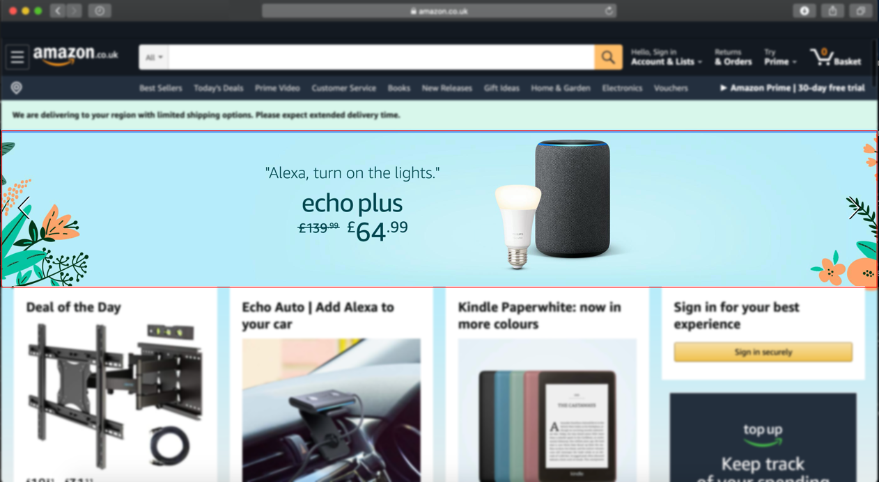
Animated interface elements are a definite advantage of a web site, as it guarantees increased attention among users. However, if such animation lasts more than five seconds, then the person should have the option to pause it or stop it, as it follows from success criterion 2.2.2, Operable, Level A. These features are particularly important for users with attention disorders or reading speed and visual perception problems. As was mentioned above, on Amazon.co.uk, there are seven horizontal images that switch between themselves at five-second intervals. This means that according to the rules of WCAG 2.1, to control the view, the interface needs a pause or stop button, which, in this case, is absent (Figure 4). Developers of this site it is recommended to pay attention to the apparent problem and add icons for animation control directly on the banner.

Lack of Text Support
- WGAC 1.1.1, Perceivable, Level A
- Manual review of the contents.
The fourth serious problem with the computer version of a web page is the lack of text support for visual design elements. Figure 5 illustrates that the product search string on the site has no signatures, making it challenging to identify the destination. While a healthy person intuitively understands what the string is for, a user with cognitive disabilities risks getting confused in the online store architecture. According to criterion 1.1.1, Perceivable, Level A, the controls elements (including the search string) must have names that indicate their destination. Otherwise, it should be concluded that the current version of the site does not meet the requirements of WCAG 2.1. It is interesting to note that the mobile version of the site does not have this problem, and consequently, the developers should use this to make adjustments: it is enough to add the inscription “Search.”

Keyboard Control
- WGAC 2.1.3, Operable, Level A
- Manual review of the contents.
Not all users can navigate the site using a computer mouse or touchpad. For this reason, an adaptive website should only be available for complete control using the keyboard, as prescribed in 2.1.3, Operable, Level A. In the case of the Amazon homepage, there is a lack of compliance with this criterion, as only keyboard use is not possible. In particular, it is possible to move the contents of the page up or down using the movement arrows or to use the Space for a quick downward slide (Figure 6). Other functionality includes using the Tab to switch between elements and the Enter to navigate the active link. As a result, it must be admitted that Amazon.co.uk is not suitable for only-keyboard control. However, there are at least two solutions to this problem. On the one hand, developers can implement navigation algorithms for the user who uses only the keys. Alternatively, Amazon.co.uk can provide information about possible keyboard shortcuts to call the external and a built-in equivalent to a computer mouse that is controlled by the navigation arrows.

References
Amazon, Amazon.co.uk [Website].
Kirkpatrick, A., Connor, J. O., Campbell, A., and Cooper, M., Web Content Accessibility Guidelines (WCAG) 2.1 [Website].
Verou, L., Contrast Ratio [Website].
