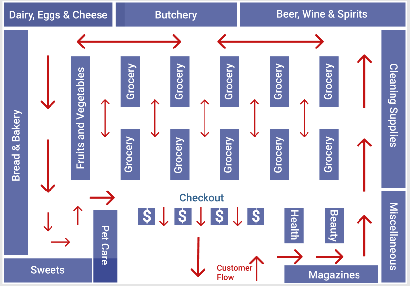
The appropriately planned facility design is an essential advantage for the company’s profit. Customer loyalty, store throughput, and, consequently, the volume of its turnover largely depend on the layout and composition of the retail space. Therefore, customers can walk through the store’s entire area, and the potential of commercial equipment must be fully utilized. The customer traffic flow among the retail elements should be convenient to understand its placement logic. The store space planning is consistent with impulsive buyer behavior and ensures each zone’s maximum economic return.
The atmosphere of the sales area should be relaxing and conducive to purchasing, including impulse buying. Furthermore, internal logistics should also remain convenient for the store staff. However, the distraction of visitors’ attention by the delights of the trading floor’s design needs to be avoided. The layout for retail space requires compliance with various planning elements depending on financial and commercial specifications. Grid layout is considered the most useful approach as this arrangement’s advantages are the efficient use of retail space and a good view of the hall.
Layout

Facility Design Elements
Description
The grocery store can be within an area of over 7,000 sq. m.; the entrance to the trading floor and exit are combined. In sales areas of rectangular configuration with a width of 7 to 12 meters, it is advisable to use a grid layout with a longitudinal equipment arrangement (Jang et al., 2018). The parallel shelves’ distance is 2.5 m, which is accurate for a store with such a retail space (Jang et al., 2018). Meanwhile, there are sale-priced items in boxes in the aisles between the wall counters and the shelves, making customer flow more difficult in this part of the surface.
Overall, the store layout should create a favorable impression and develop a sense of spaciousness. For grid planning, it is essential to select the optimum aisle width. It depends on customers’ behavior in different areas and the direct link on the shelves’ height and aisles’ width. Optimal solution for the aisles’ width would be about 1.4-2 meters (Jang et al., 2018). Wide aisles are ineffective because they take more space, and buyers only check those goods placed on the closest shelf.
Customer Traffic Flow
The sales area’s grid layout enables forming the proper traffic flow of buyers. It creates better conditions for grouping and placement of goods and provides a better view of the retail floor (Russell and Taylor, 2019). In a linear planning environment, consumers perceive information about products most effectively. Changing the length of the lines regulates buyers’ concentration in different parts of the trading floor (Jang et al., 2018). The customers’ traffic flow is most often counter clockwise movement; people walk from right to left, for the most part of visitors are right-handed (Russell and Taylor, 2019). Consequently, the entrance to the store should be designed on the right side.
Space Planning
Different zones in retail space are not equal in terms of profit gain. Considering the customer traffic flow, the buyer in the store entrance quarter makes about 40% of purchases (Ying et al., 2019). The second area makes about 30%, in the third only 20% of buying occurs, and the remaining space takes 10% (Ying et al., 2019). There are also statistics that 80% of buyers bypass all sale points located along the perimeter, and only 50% of buyers avoid the inner rows (Ying et al., 2019). For competent zoning and following potential buyers’ preferences, all goods categories can be conventionally divided into everyday products, periodic demand and impulsive buying (Ying et al., 2019). As a rule, the most profitable products are placed in the intensive trade zone near the retail space entrance (Ying et al., 2019). Daily goods are mainly set in the second and third parts of the room, mostly along the perimeter to equalize the return. The consumer path is accompanied by related products, stimulating impulse purchases.
It is recommended to use the length of the lines of gondolas no more than 20 meters, since their size will lead to an excessive increase in the flow of customers in the store and, thus, limit their movement in the sales area. A checkout area is a place where buying goods without planning are also made. It is necessary for shelves with impulse demand goods to provide separate locations without reducing the checkout space free area.
Conclusion
Despite multiple benefits, the monotony of racks and counters lined up in one line quickly overburdens the visitor. It can be restored by using unusual configuration equipment in height, shape and appearance. This perception of the store sometimes develops in customers’ minds involuntarily due to prolonged use of its services. However, managers’ specific ideas can be formed through certain organizational activities and marketing efforts. Comfortable layout and an attractive interior are crucial elements of a facility design created in customers’ minds which often provoke them to make purchases. All goods in the store should be placed to access them easily, besides that, showcases and each product should be completely open for the client’s review.
References
Jang, J. Y., Baek, E., Yoon, S. Y., & Choo, H. J. (2018). Store design: Visual complexity and consumer responses. International Journal of Design, 12(2), 105-118.
Russell, R. S. & Taylor, B. W. (2019) Operations and Supply Chain Management (10th ed.). John Wiley & Sons.
Ying, F., Wallis, A. O., Beguerisse-Díaz, M., Porter, M. A., & Howison, S. D. (2019). Customer mobility and congestion in supermarkets. Physical Review E, 100(6), 1-16. Web.
