Company Overview
General Electric Company (GE) is an American multinational founded in 1892 with headquarters in Boston, Massachusetts. The company is one of the largest industrial giants in the world. It has many divisions such as aviation, power, healthcare, renewable energy, digital industry, venture capital and finance, and additive manufacturing (Gryta & Mann, 2020). The company was ranked 33rd largest in the US in the fortune 500 in gross revenue in 2020 (Gryta & Mann, 2020). In 2011, GE was in the top 20 of the US’s most profitable companies, but the situation has changed since then. GE had total assets of 253.542 billion dollars as of 2020 (Gryta & Mann, 2020). The company had $75.62 billion in revenue, an operating income of $5.197, and a net income of $5.23 billion (Gryta & Mann, 2020). GE also had total equity of $35.55 billion (Gryta & Mann, 2020). These are staggering figures that illustrate the might of GE.
GE has many divisions that engage in a wide range of services; its power segment offers products and services primarily in the energy sector, such as gas and steam apparatus, power generation services, and generators. The renewable energy division concentrates on wind turbines, hydroelectric power solutions, offshore wind turbines, hardware and software solutions, high voltage equipment, and blades for onshore and offshore turbines (Gryta & Mann, 2020). GE’s aviation division provides aeronautical products and services such as aircraft engines, turboprops, maintenance, repair services, overhaul services, parts replacement, additive machines, and engineering services (Gryta & Mann, 2020). Its healthcare division is involved in healthcare products such as digital imaging, patient monitoring, digital solutions, diagnostics, biopharmaceutical, drug discovery, and performance enhancement solutions. The capital division is involved in leasing and financing aircraft, engines, and helicopters and providing financial and underwriting services. GE has had problems over the past decade and has done considerable restructuring, including appointing a new CEO and selling some of its segments to generate cash.
Graphical Representations of Data
A Scatter Plot of Stock Highs Against Time
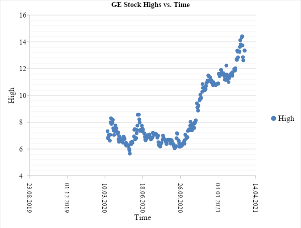
Figure 1 is a scatter plot of General Electric’s daily highs of its stock prices from March 17, 2020, to March 16, 2021. It is a graph of two variables: highest stock prices in USD on the vertical axis and time in days on the horizontal axis; it is a linear graph. From the graph, for the period up to October 2020, the stock fluctuated around 6 dollars with two crests when it would cross 8 dollars then go back to the 6-dollar average. The relationship between the dependent variable and the independent variable becomes positive from October, indicating that the stock was increasing in price. The stock rose from 6.3 dollars in October 2020 to 14 dollars by March 08, 2021; it more than doubled in approximately five months.
A plot of Low vs. Time
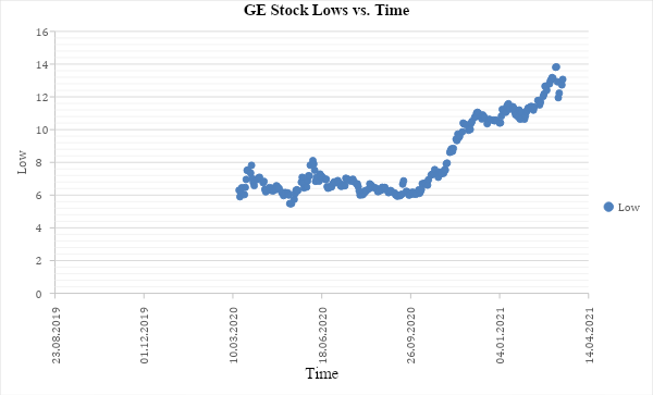
The above figure is a plot of General Electric’s ‘lows’ stock price against time or a period of 1 year between 17, March 2020 and March 16, 2021. The dependent variable is on the vertical axis and represents the stock price’s daily lows, while the horizontal axis is the independent variable indicating time. The graph suggests that the average slope was zero for a period up to the end of September 2020. If one were to draw a line of best fit for the period up to the end of October, it would be parallel to the horizontal axis. This would indicate zero gradients hence no average increase in the stock price. The situation, however, did change after October 2020, when a line of best fit would show a positive correlation. This means that GE’s stock price has been on the rise since.
Histogram for Adjusted Daily Closing
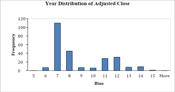
Figure 3 above is a histogram. A histogram is a diagram used to indicate the distribution of a variable. In the above histogram, the histogram is that of the adjusted close for GE’s stock for one year between March 17, 2020, and March 16, 2021. The diagram shows that the bins with the highest frequency are concentrated on the left; this means that the distribution is not symmetrical and is a right-skewed distribution because there are many outliers on the right.
Parametric methods are typically used for variables measured on the continuous scale; luckily, adjusted close is on this scale. Another condition for parametric tests is that the variable follows a normal distribution. The yearly distribution of adjusted close for GE’s stock is not normally distributed and would not qualify for parametric methods ideally. However, because the sample is large enough, the variable can qualify for parametric methods.
Histogram Showing Distribution of GE’s Trading Volume
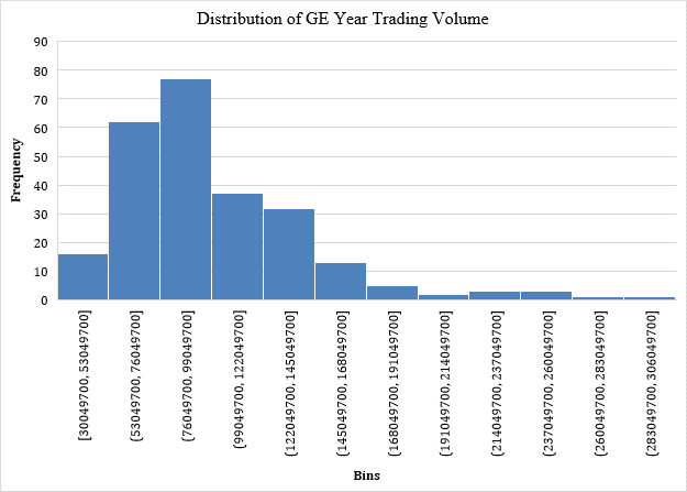
Figure 3 above is a histogram. A histogram is a diagram used to indicate the distribution of a variable. In the above histogram, the histogram is that of the trading volume for GE’s stock for 1 year between March 17, 2020, and March 16, 2021. The diagram shows that the bins with the highest frequency are not concentrated in the middle. The shape of the chart means that the distribution is not symmetrical. This is a right-skewed distribution because there are outliers on the right. The yearly distribution of trading for GE’s stock is not normally distributed and would not qualify for parametric methods ideally. However, because the sample is large enough, the variable can qualify for parametric methods.
Descriptive Statistics
GE’s Descriptive Statistics Adjusted Close
Table 1: GE stock’s year adjusted close descriptive statistics
The above table (1) represents descriptive statistics of the adjusted close of GE’s stock over one year. The mode is an indicator of the most occurring value in distribution; in this case, its value was 6.44. This means that $6.44 was the most occurring price of GE’s stock. The mean is the arithmetic average of the data, while the median is the middle of the dataset. The mean of the variable is $8.29, while the median is $7.04. These values are not the same, which indicates that the distribution is asymmetrical and shows the presence of outliers on the high side that have skewed the mean.
The mean, mode, and median are called the measures of central tendency, and when they differ, it shows that the distribution is skewed. This skewness is an indicator of fluctuations in GE’s stock price. The standard deviation is a measure of disparity from the mean of a distribution; in terms of the stock price, the standard deviation can tell the level of volatility. In GE’s case, the standard deviation was $2.3, which shows a low risk of investing in GE.
GE Stock’s Volume
Table 2: GE stock’s year trading volume descriptive statistics
Table 2 shows the descriptive statistics of GE’s trading volume for the trading year between March 17, 2020, and March 16, 2021. The mean, mode, and median of distribution are called the measures of central tendency; they indicate the center of the data, albeit each in its own way. The mean, which is the arithmetic average, is $100,851,655; that is a huge number for a stock volume and indicates that GE is an attractive stock with high liquidity. However, the mean differs from the median, which is $92,494,000; this shows that the distribution of the variable is not symmetrical and that there are outliers. In this case, there are outliers on the higher side of the distribution in the form of daily volume spikes. These spikes have skewed the mean to be higher than the median. The standard deviation of the data indicates the disparity in the distribution. From trading volume data, the standard deviation is $42,370,476; this is a relatively large number that suggests volatility in GE’s trading volume.
Business Insights from the Statistics
Figure 1 for GE’s stock highs indicates that the stock had a long period of sideways movement up to October 2020. During this period, there were occasional plunges followed by a quick recovery back to the mean. After October 2020, GE’s stock price has more than doubled in price. If one were to analyze the stock price aiming to invest, it would be prudent to wait until there has been a correction from this almost parabolic movement in such a short period. However, the best move would be to gather more data from earlier periods, indicating that GE has been in the lows for an extended period. The parabolic movement likely shows that the company is on a recovery trajectory, and investors are starting to have confidence in their turn-around plans.
The second scatter plot is that of GE’s stock daily lows for the same analysis period between March 2020 and March 2021. The graph indicates a stagnation period when the stock was moving sideways; that is up to the beginning of October when the stock made tremendous gains over a short period. This would indicate that there is likely going to be a correction after such a parabolic price increase. For investors that bought lows, now would be a time to take profits, while for prospective buyers, it would probably be prudent to wait for a correction before investing. However, for a more informed decision, the best decision would be to acquire more data for a more extended period and to pay attention to GE’s long-term plans.
The adjusted close distribution shows that the graph does not indicate a normal distribution; this indicates that the price has been volatile. The skewness is to the right, meaning the price spikes have been more than the dips. This theory is supported by the scatterplots showing a dramatic price action over the past five months, leading to more than doubling. Risk is directly proportional to volatility; there is a high probability of reaping massive rewards or incurring huge losses trading volatile stocks. GE is not supposed to be a volatile stock given that it is one of the world’s largest companies, but it is at an inflection, make-or-break situation, and many investors are paying attention. It is also likely that the volatility was just a recovery from the COVID-19 economic meltdown.
The trading volume statistics are also from the same period between March 2020 and March 2021; they indicate that GE has a high trading volume and it’s a stock with sufficient liquidity. However, the volume distribution is also not normal; the mean is skewed towards the right indicating daily volume spikes were more than plunges. The volume volatility is not extreme for investors to fear a lack of liquidity if they wanted to enter a position.
This paper has looked at GE’s stock performance over the past year. In light of the year 2020, GE seems to have seen some recovery in its stock price. The narrative of a fallen giant has plagued GE for a long time, but it is a respite for long-term investors to witness a positive movement. Maybe the tide is changing for GE, and they are on the recovery path. GE will undoubtedly be a stock to watch as the world economy recovers from the ravages of the COVID 19 pandemic.
References
General electric company (Ge) stock historical prices & data (n.d.). Yahoo finance. Web.
Gryta, T., & Mann, T. (2020). Lights out: Pride, delusion, and the fall of General Electric. Houghton Mifflin Harcourt.